INTERACTIVE WHITEBOARDS

Jump Ahead Too

How to Choose the Right Interactive Whiteboard for Your Room

Most schools and businesses assume selecting an interactive whiteboard starts with comparing brands, then deciding which screen size fits their budget. We think that's working backwards.

The display itself is only one part of the decision. Room size, viewing distance, natural light, mounting height and how the room will be used every day usually have a much greater influence on whether an installation succeeds. Once those factors are understood, comparing LG, Samsung, BenQ, SMART or Promethean becomes far simpler because the room has already narrowed the shortlist.

If you're just starting your research, our Interactive Whiteboard educational pillar explains the different technologies, brands and applications. The page focuses specifically on how to evaluate a room and choose the right interactive whiteboard.

We'll work through viewing distance, brightness, viewing angles, mounting, platform choices and connectivity in the same order we assess every installation. Read the headings and the first couple of paragraphs of each section to understand the overall process, then expand the topics you'd like to explore in more detail. If, along the way, you realise an interactive whiteboard isn't actually the right fit for your room, our Digital Signage hub explains when a commercial display is the better solution.

  • VENDOR-NEUTRAL
  • SCHOOLS & BUSINESSES
  • AUSTRALIA-WIDE FREIGHT
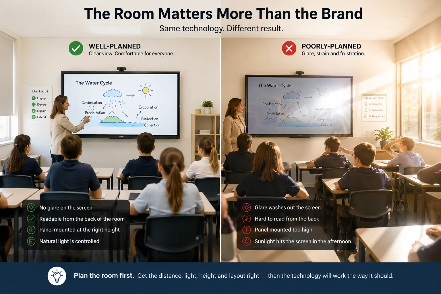
Interactive whiteboard mounted in a classroom with afternoon light entering through a side window

Why Interactive Whiteboards Are About More Than Screen Size

Most schools and businesses naturally start this decision by asking how big the screen should be. It's a reasonable place to start — size is concrete, comparable, and easy to put a number on. What's usually missed is that size is the last decision, not the first. It depends on how far the furthest viewer sits, how bright the room gets in the afternoon, and whether the board is fixed to a wall or moved between spaces. Decide those first, and the size answers itself.

This is what we regularly see: the budget goes toward a bigger panel, and the actual problem turns out to be glare from a north-facing window, or a mounting height that leaves shorter students unable to reach the bottom of the board. The panel wasn't the wrong choice. The room simply hadn't been thought through yet.

ANDREW'S OBSERVATION

The most expensive display in the room can't overcome poor room design.

  • Before looking at a single specification, we ask the same four questions every time — for a classroom, a boardroom or a training room.

    How far away is the furthest viewer?

    Sets the minimum practical screen size for the room.

    How bright is the room?

    Determines whether standard or higher brightness is worth paying for.

    Who actually touches the screen?

    Shapes mounting height and how forgiving the touch experience needs to be.

    What happens here every day?

    Decides whether camera, audio and platform choices matter at all.

    We'd call this the Room Before Brand principle. Answer those four honestly and most of the brand and spec comparisons that follow become far easier, because the room has already ruled out half the options for you.

    A COMMON SCENARIO

    We've quoted enough classrooms to know exactly what happens next. Somebody points at the 86-inch model and says, "for another couple of thousand we may as well go bigger." Five minutes later everyone is discussing screen sizes and nobody has asked where the afternoon sun comes from. The panel wasn't the wrong choice, three months later, when the glare complaints started. The room simply hadn't been thought through yet.

    If there's one habit worth adopting across the rest of this page, it's this: spend roughly eighty percent of the decision on understanding the room, and twenty percent comparing brands. Most buyers do the reverse — and it's usually why the panel ends up blamed for something the room was always going to cause.

Interactive Display Mounting Height and Ergonomics

Most buying decisions treat mounting as an installation detail. It isn't—it's one of the few parts of an interactive display people physically interact with every day. The display needs to suit the shortest regular user, not the average adult in the building.

If nobody told your teachers the board was the latest model, would they notice on Monday morning? Usually not from the panel itself — but they'd notice within a week if the mounting height was wrong, because that's the part they touch every single day.

ANDREW'S OBSERVATION

One organisation selected a 98-inch interactive whiteboard because it suited the room perfectly. What nobody considered was the people using it. Several members of the management team couldn't comfortably reach the top of the display during presentations.

The board stayed exactly where it was — it simply became an expensive reminder that a room should be designed around the people using it, not just the wall it's mounted on.
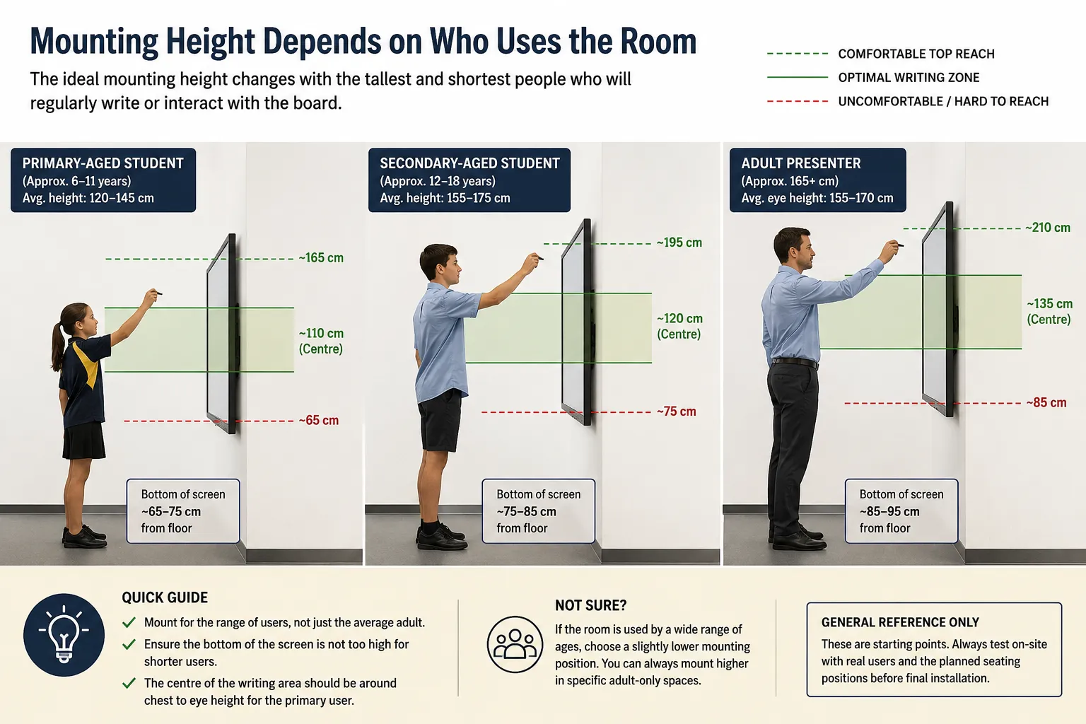
  • A primary classroom and a corporate boardroom call for genuinely different mounting heights, and getting this wrong either leaves younger students unable to reach the interactive area, or leaves everyone else reaching awkwardly.

    Diagram comparing interactive whiteboard mounting height reach zones for primary students, secondary students and adult presenters

    Mobile stands tend to suit rooms shared across different age groups or purposes through the week — a hall used by both junior and senior students, or a training room booked by different teams. Fixed wall mounts suit rooms with one consistent user group, where the extra stability and lower cost outweigh the flexibility a mobile stand offers.

    This decision is at least as important as the panel itself, and it's the one most often left until installation day — by which point it's a far more expensive change to make.

Selecting the Right Interactive Display Size for Your Room

Most people think this section is about picking a number. It's actually about picking a distance. Viewing distance is generally four to six times the height of the screen for detailed content like text and diagrams, stretching further for video or simple presentations. Once that distance is known, selecting between a 75-inch or 86-inch interactive display stops being guesswork.

In our experience across classrooms, training rooms and boardrooms, 75-inch has become the most commonly selected size, remaining comfortable to roughly 6–7 metres. Once the back row extends beyond that, an 86-inch interactive display generally becomes the better choice.
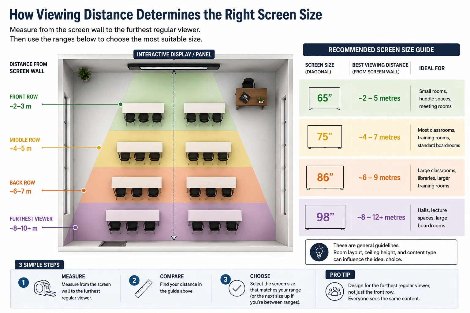
Diagram showing interactive whiteboard viewing distance ranges for 65, 75, 86 and 98 inch screen sizes
ANDREW'S OBSERVATION

Bigger screens are surprisingly tempting at the quoting stage. In many rooms, though, the extra eleven inches make far less difference than improving the viewing distance, reducing glare or mounting the display at the correct height.

    • 65-inch interactive display suits smaller rooms or huddle spaces, where the furthest viewer sits within about 4–5 metres.
    • 75-inch is, in our experience, the most commonly selected classroom size, remaining comfortable to roughly 6–7 metres.
    • 86-inch suits larger classrooms, libraries or training rooms where the back row extends beyond about 7 metres.
    • 98-inch is worth considering for lecture spaces, halls or larger boardrooms, though it's a genuinely different scale of installation rather than simply a bigger panel.
    KICKSTART TIP

    Measure twice before comparing products. The most important measurement isn't the wall — it's the distance from the interactive display to the furthest regular viewer.

    The simplest way to check this in your own room is to measure from the display wall to the back row, then compare that distance against the ranges above rather than assuming another classroom, boardroom or organisation has the same viewing distance as yours. Two rooms with the same floor area can have very different viewing distances depending on how they're laid out.

Viewing Angles and Sight Lines for Interactive Flat Panels

Most people assume that if an interactive flat panel is big enough and bright enough, everyone in the room sees the same image. In reality, they rarely do. Screen size calculations assume people are looking straight at the display, yet in many classrooms, training rooms and boardrooms that simply isn't the case.

It's worth standing in the worst seat in the room before making a final decision. Nobody complaining isn't the same as nobody noticing. More often than not, people simply adapt to a viewing problem because they assume it's normal. A simple habit we've adopted over the years is to stand in the seat with the worst view of the room, not the best. If the display is easy to read from there, everyone else is usually going to have a better experience.
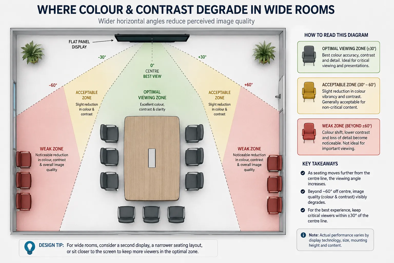
  • Not all interactive flat panels perform equally when viewed from the side. Two displays can have almost identical specifications for size and brightness yet provide noticeably different viewing experiences once people move well off centre. This rarely matters in a narrow classroom where everyone faces forward, but it becomes far more important in wide rooms, L-shaped spaces or boardrooms where seating wraps around a table.

    Overhead diagram showing interactive whiteboard viewing angles and reduced viewing zones at the far side of a room

    Why Panel Technology Matters

    Manufacturers often publish similar viewing angle specifications, commonly around 178 degrees, but those figures don't always reflect how well colour, contrast and brightness are maintained once people move well off centre. The underlying LCD panel technology usually has a greater influence on the viewing experience than the specification sheet suggests.

    Typical viewing angle characteristics of common LCD panel technologies used in commercial interactive displays.
    Room LayoutPanel TechnologyWhy It Suits
    Wide classroomIPS or ADS / ADS ProMaintains colour, contrast and brightness more consistently for students seated well off centre.
    Boardroom with seating around a tableIPS or ADS / ADS ProProvides a more consistent viewing experience from multiple seating positions.
    Long, narrow classroomIPS, ADS / ADS Pro or VAViewing angles become less critical because most people face the display directly.
    Lecture theatreIPS or ADS / ADS ProHelps maintain image quality for people seated further to the sides.
    KICKSTART TIP

    Don't compare viewing angle numbers alone. Two interactive flat panels can both quote 178° viewing angles yet provide noticeably different colour and contrast once viewed from the side. Understanding the underlying panel technology often tells you far more than the specification sheet.

    If your room is narrow and deep, viewing angles are unlikely to influence your buying decision. If it's wide, seating wraps around a boardroom table, or people regularly sit well off centre, this deserves far more attention before comparing brands. The important point isn't that one panel technology is always better than another—it's that the room should determine which strengths matter most.

Commercial Display Brightness (Nits): How Bright Is Bright Enough?

Most people read brightness as a bigger-is-better number. It isn't. We've yet to meet a teacher who wished their interactive display was five percent brighter because of something written on a specification sheet. What people actually notice is glare at 2pm, reflections from classroom windows, and whether those at the back of the room can still comfortably read the display.

The more useful question isn't how bright the display is. It's whether the room is bright enough for that extra brightness to actually make a difference. If blinds, curtains or external shading are already controlling most of the ambient light, paying for a significantly brighter display often delivers very little practical benefit. Brightness fights glare. Good room design often eliminates it.
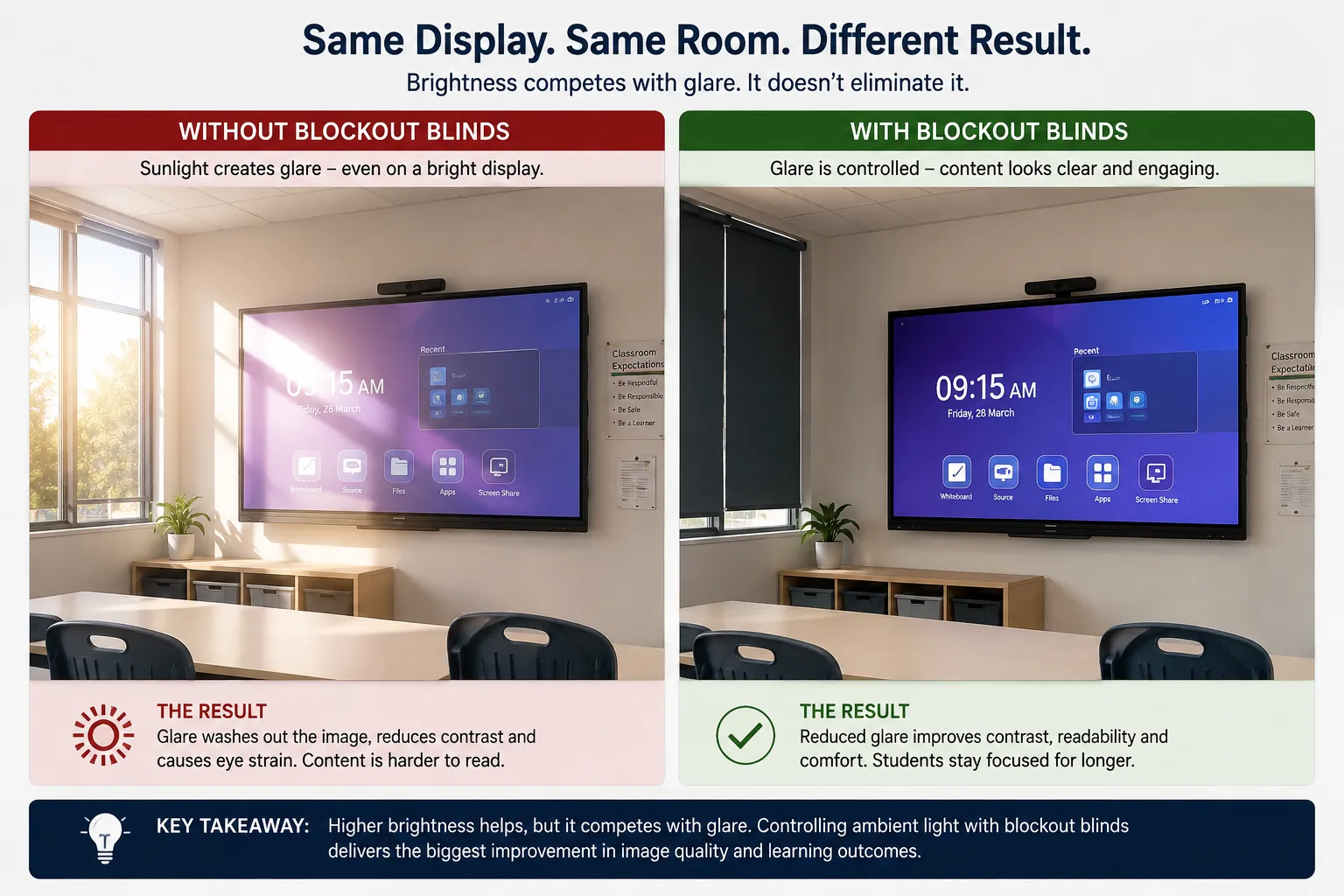
Comparison showing how glare affects interactive display readability and how blockout blinds improve visibility
  • A nit is simply the unit used to measure how much light a commercial display produces. Higher nit ratings don't automatically create a better viewing experience. They simply allow a display to compete more effectively against brighter rooms and stronger ambient light.

    Factors that influence how much display brightness is required.
    Room EnvironmentAmbient LightWhat to Check First
    Windowless meeting roomLowStandard commercial brightness is usually sufficient.
    Typical classroom with blindsModerateCheck how well the blinds control afternoon sunlight.
    Training room with large windowsHighLook for direct sunlight reaching the display.
    West-facing roomsVery HighImprove glare control before comparing brighter displays.

    A windowless room rarely needs anything beyond standard commercial brightness. A classroom with ordinary blinds generally benefits from standard commercial display brightness, while rooms with strong afternoon sun or large uncovered windows need either a brighter display or better control of ambient light. The best installations usually balance both rather than relying on brightness alone.

    SOMETIMES THE BIGGEST IMPROVEMENT COMES FROM SOMETHING OTHER THAN THE DISPLAY

    A quality set of blockout blinds can often remove glare more effectively than spending thousands of dollars on a brighter display. Before upgrading the hardware, compare the cost of improving the room itself. In many situations it's the better long-term investment.

    Before comparing brightness specifications, spend five minutes in the room at the brightest time of day. It's one of the simplest checks you can make, and it often tells you more than any specification sheet. The goal isn't to buy the brightest commercial display available—it's to choose one that's correctly matched to the environment where it will be used every day.

4K Display Resolution, Text Clarity and Readability

Most buyers ask whether an interactive display is 4K, as though the answer decides everything. In reality, almost every commercial interactive display sold today is 4K. The more useful question is whether resolution is actually the factor limiting readability in your room. For most classrooms, training rooms and boardrooms, it isn't.

Would anyone in your room notice a resolution limitation before they noticed poor viewing distance, glare or incorrect mounting height? In most cases, the honest answer is no. That's why resolution appears much lower on this page than room layout, screen size and brightness.
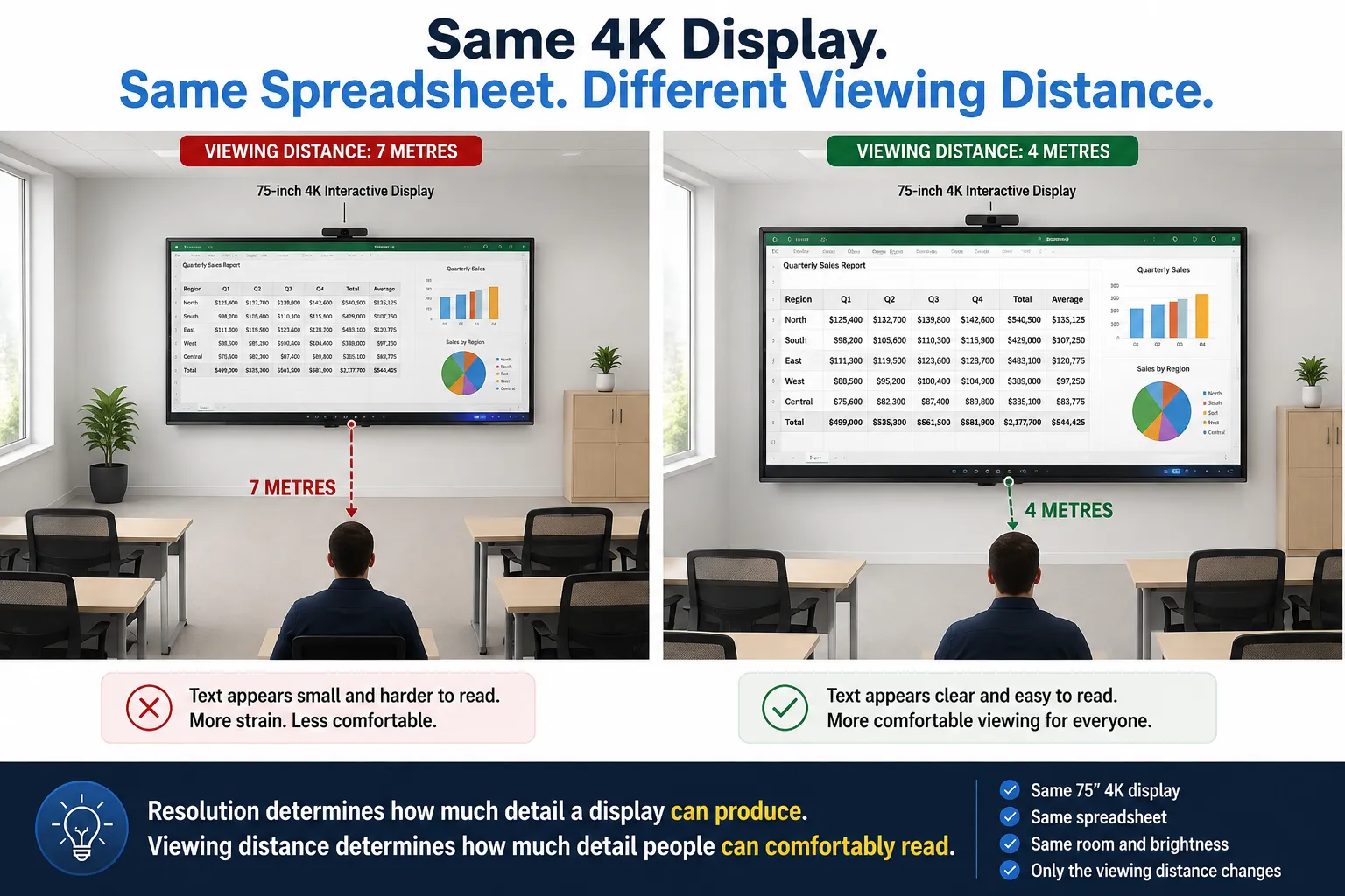
  • A decade ago, many interactive displays used Full HD (1920 × 1080) panels. Today, 4K Ultra HD (3840 × 2160) has become the standard across almost every commercial interactive display. Because of that, buying decisions are now much more likely to be influenced by room layout, screen size, brightness, operating platform and connectivity than by resolution alone.

    Resolution determines how much detail a display can produce, but it doesn't determine how much detail people can actually see. That depends just as much on screen size, viewing distance and the type of content being displayed. A finance team analysing large spreadsheets or an engineering class reviewing CAD drawings will notice the benefits of 4K far sooner than a classroom presenting slides or watching video.

    Comparison showing how viewing distance affects readability on the same 4K interactive display
    Situations where 4K resolution makes the biggest difference.
    Content Being Displayed Does 4K Matter? Why
    Presentations Rarely Large text and graphics remain easy to read at normal viewing distances.
    Video playback Rarely Motion and viewing distance generally influence the experience more than resolution.
    Large spreadsheets Often Small text benefits from greater pixel density.
    CAD drawings Yes Fine lines, dimensions and annotations are easier to distinguish.
    Medical imaging Yes Maximum image detail is often essential.
    KICKSTART TIP

    If people can't comfortably read the content on your display, don't automatically assume you need more resolution. Check the viewing distance, screen size and text size first. In most rooms, those factors have a far greater impact on readability than resolution alone.

    Resolution determines what a display can show. Viewing distance determines what people can comfortably read. A correctly sized interactive display positioned at the right distance will often deliver a better reading experience than a larger display mounted too far away, even when both use the same 4K panel.

Interactive Display Writing Experience

This is one of the few things a specification sheet genuinely can't communicate, yet it's often what determines whether teachers and presenters enjoy using an interactive display every day or gradually stop relying on its interactive features. Two displays can appear almost identical on paper and feel completely different the moment someone starts writing.

Where it's practical, a hands-on trial before a fleet-wide purchase usually reveals more than another hour spent comparing specification sheets. Five minutes of real writing often tells you more than twenty pages of product brochures.
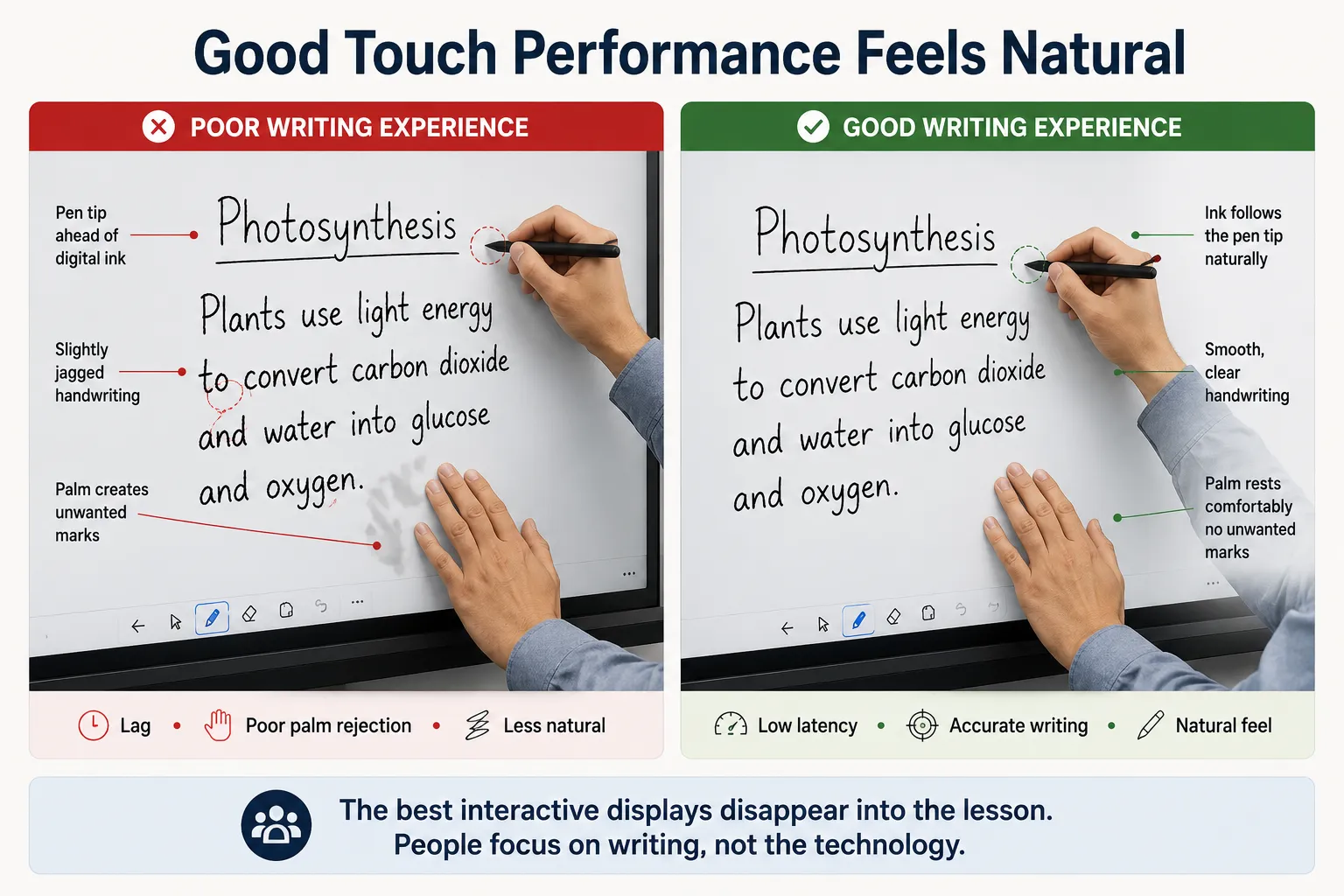
  • Unlike brightness or resolution, touch performance affects every lesson, meeting or presentation because it's something the presenter experiences every single time they write. The best interactive displays disappear into the background—you stop thinking about the technology and simply write naturally.

    The things worth testing directly rather than trusting on paper include:

    • Whether the panel ignores your palm while you're writing (palm rejection).
    • How quickly the pen keeps up with fast handwriting (pen latency).
    • Whether touch accuracy remains consistent near the edges of the display, where some panels perform less accurately than the centre.
    • Whether handwriting feels smooth and natural or slightly delayed.
    • Whether switching between writing, erasing and multi-touch gestures feels intuitive.
    Comparison showing poor and excellent interactive display writing performance including pen latency and palm rejection
    Simple checks to evaluate writing performance during a demonstration.
    What to Test Why It Matters
    Pen latency Ink should follow the pen naturally without noticeable delay.
    Palm rejection Resting your hand on the display shouldn't create unwanted marks.
    Edge accuracy Writing near the edges should feel just as accurate as the centre.
    Erasing and gestures Switching between writing, erasing and touch gestures should feel intuitive.
    KICKSTART TIP

    Write at your normal speed. Don't slow down for the display. A good interactive display should keep up with you—not the other way around.

    A teacher or presenter who writes quickly will usually notice lag within the first sentence, long before it ever appears as a complaint about "the technology." The best interactive displays are the ones people stop noticing because they simply feel natural to use. Schools weighing this up should also factor in ecosystem and rollout — our page on what Australian schools need to know before choosing a classroom display covers the platform decisions that sit alongside writing feel.

Interactive Whiteboard Glass, Reflections and Ambient Lighting

Most interactive whiteboard demonstrations take place under lighting that doesn't reflect a real classroom. A display that looks exceptional in a showroom can perform quite differently once fluorescent lighting, afternoon sun and classroom reflections become part of the equation.

Many buyers naturally assume anti-glare glass makes a display brighter. It doesn't. The panel produces exactly the same amount of light. What changes is how much unwanted light from windows and ceiling fittings is reflected back towards your eyes. By reducing those reflections, the display preserves more contrast, making text, colours and fine detail appear clearer. In a bright classroom, two displays with identical brightness ratings can therefore look noticeably different simply because one controls reflections more effectively than the other.
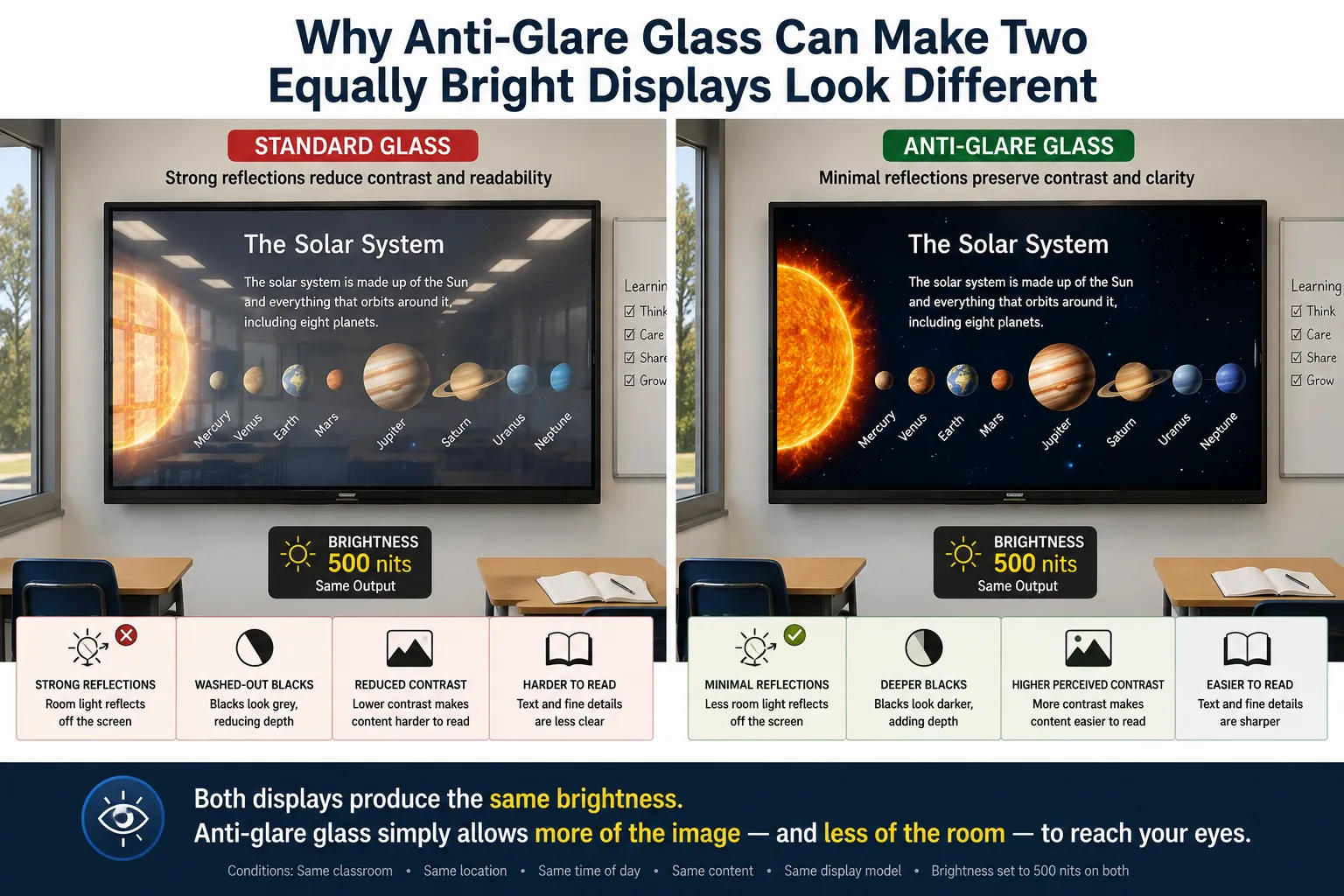
Why anti-glare glass can make two equally bright 500 nit interactive whiteboards look different — standard glass with strong reflections versus anti-glare glass with better contrast
ANDREW'S OBSERVATION

The room usually decides the display, not the other way around. Even the best anti-glare glass can't overcome direct sunlight reflecting from an uncovered window. If the room is working against the display, blinds or a better mounting position will usually improve readability more than simply buying a brighter panel.

  • Why doesn't every manufacturer publish an anti-glare rating?

    Unlike brightness, there isn't a universally adopted specification that allows buyers to compare anti-glare performance across every manufacturer. Some brands publish haze percentages, some quote reflectance values, some describe the treatment — anti-glare coating, AG glass, etched glass, chemically etched glass, optical bonding with AG glass — and others simply write "anti-glare glass" with no measurable figure at all. Because manufacturers don't always use the same test methods or publish the same measurement conditions, comparing a figure from one brand's spec sheet directly against another's isn't as straightforward as comparing nits.

    Haze percentages are also easy to misunderstand as a simple "higher is better" specification. They aren't. Think of haze as a balance between reducing reflections and preserving image sharpness. Increasing haze generally helps diffuse reflected light, making glare less distracting, but taken too far it can also soften the image slightly, reducing the crispness of fine text and detail. Quality interactive displays aim for the middle ground: enough haze to control reflections without noticeably compromising image clarity. While a haze percentage can be useful when comparing models within the same manufacturer's range, treating it like a brightness rating and comparing the numbers directly across different brands is where many buyers go wrong.

    Why glare makes a display look dimmer, even though it isn't

    Imagine two identical 500-nit interactive whiteboards installed in different classrooms. One is mounted in a room with well-controlled lighting, while the other sits opposite large uncovered windows. The second display is receiving far more unwanted reflected light from the room. Your eyes don't separate those two sources—they simply receive the image from the display and the reflected ambient light together as one combined visual signal. As those reflections increase, blacks become washed out, contrast falls, colours lose punch and fine text becomes harder to distinguish. Nothing about the display's own brightness has changed; it's simply competing against more unwanted light than it was designed for. That's why quality anti-glare glass can make two displays with exactly the same brightness rating appear noticeably different. It isn't creating more light—it is reducing the reflections that were working against the image in the first place.

    Which lighting causes the most problems?

    Not all lighting is equally difficult, and it's worth knowing which situations genuinely can't be fixed by the panel alone:

    • Direct sunlight — by far the worst case. A sunbeam reflecting straight into the panel can overwhelm almost any commercial display, and no anti-glare coating fully eliminates it.
    • Large uncovered windows — the second most common issue, especially west-facing classrooms in the early afternoon, which is exactly when the board is often in use.
    • Fluorescent tube lighting — still common in older Australian classrooms. The issue isn't usually brightness so much as the long, linear reflections these fittings create across glossy glass — visible as bright bands running across the display. Good anti-glare glass reduces this considerably.
    • LED panel lighting — increasingly common in newer classrooms, and generally an improvement: more even light distribution, fewer harsh reflections, and often dimmable. Not glare-free, but usually kinder to a display than old fluorescent fittings.
    • Corporate meeting rooms — often the easiest environment of all, with controlled LED lighting, blinds, curtains and fewer windows directly opposite the display. Schools generally don't have that luxury — classrooms tend to be larger, brighter, and mounted wherever the old whiteboard happened to be, which is why they're often a more demanding environment for a display than a boardroom.

    Many Australian classrooms were never designed with interactive displays in mind. Displays are often mounted where the original whiteboard was located, regardless of window orientation or overhead lighting. As a result, schools frequently present a more demanding environment than modern corporate meeting rooms, which are more likely to have controlled LED lighting, window coverings and lighting designed around presentation screens.

    A USEFUL WAY TO THINK ABOUT IT

    Anyone who's worked on a car has probably experienced this. You're trying to line up a split pin through a polished steel shaft, so you shine a powerful LED torch straight at it. Instead of making the job easier, the reflections from the shiny metal can actually hide the hole you're trying to see. Move the torch to one side, reduce the reflections, and the hole suddenly becomes obvious. Nothing changed about the shaft — you simply removed the light that was getting in the way. Interactive whiteboards behave in much the same way. It's not always about producing more light; it's about allowing your eyes to see more of the image and less of the room around it.

    The eye doesn't care how much light a display produces. It cares how much of that light it can actually distinguish from everything else in the room.

    If you're comparing two displays, try to view them side-by-side under lighting that closely resembles the room where they'll actually be installed. In most cases, that real-world comparison will tell you far more about glare performance than a specification sheet ever can.

Interactive Whiteboards, Hybrid Learning and Camera Placement

Most people compare camera resolution before they think about where the camera is actually mounted. Yet once an interactive whiteboard is used for hybrid learning or remote meetings, camera position, field of view and the ability to capture everyone in the room usually have a much bigger impact than whether the camera records in 4K or 8K.

Rooms used mainly for video conferencing are often better served by pairing an interactive display with a dedicated conferencing camera and audio system rather than relying entirely on the camera built into the panel.

If your room is primarily used for meetings rather than teaching, our meeting room resources explain this in more detail. Where you're looking for an all-in-one collaboration display, our Yealink MeetingBoard page is also worth exploring.

  • The same built-in camera performing well in a small room but poorly in a long boardroom, showing why room shape matters more than camera resolution

    Built-in cameras work well when everyone stays close to the display. Once rooms become wider, deeper, or regularly host hybrid meetings, camera placement becomes much more important than camera quality.

    Whether a built-in camera is likely to be enough, by room layout.
    Room LayoutBuilt-in CameraDedicated Camera
    Small room (2–4 people)Usually sufficientOptional
    Medium room (5–8 people)Often suitableWorth considering
    Large roomSometimes limitedUsually recommended
    Long boardroomUsually limitedRecommended
    Hybrid classroomOften limitedStrongly recommended

    This is usually worth working out before the room is fitted out — retrofitting a separate camera and audio system after installation typically costs more than specifying it correctly the first time.

    Interestingly, remote participants usually forgive average video quality much sooner than poor audio. If people can't clearly hear who's speaking, even the best camera won't rescue the meeting.

    An expensive camera can't see around people standing in front of it. If the presenter regularly blocks the camera while writing on the display, relocating the camera often produces a bigger improvement than upgrading it.

    A SIMPLE TEST

    Don't stand where the presenter stands. Sit where the remote participant sees the room from. That's the experience you're actually designing.

    The best conferencing experience isn't created by the highest-resolution camera. It's created when every participant — whether they're sitting in the room or joining remotely — can clearly see and hear what's happening.

Speech Clarity, Audio Performance and Room Acoustics

Most people assume poor audio simply means the speakers aren't loud enough. In reality, speech clarity is usually the problem. Once conversations become difficult to understand, turning the volume up rarely fixes it. Instead, voices begin competing with room reflections, background noise and distance, making meetings and lessons far more tiring to follow.

Built-in speakers are generally adequate for small meeting rooms, classrooms and presenters standing close to the display. As rooms become larger, deeper or regularly host hybrid meetings, dedicated speakers and microphones often deliver a far bigger improvement than buyers expect. If your room is regularly used for video conferencing, our conference microphones and audio catalog covers dedicated microphones, speakers and conferencing systems in more detail.
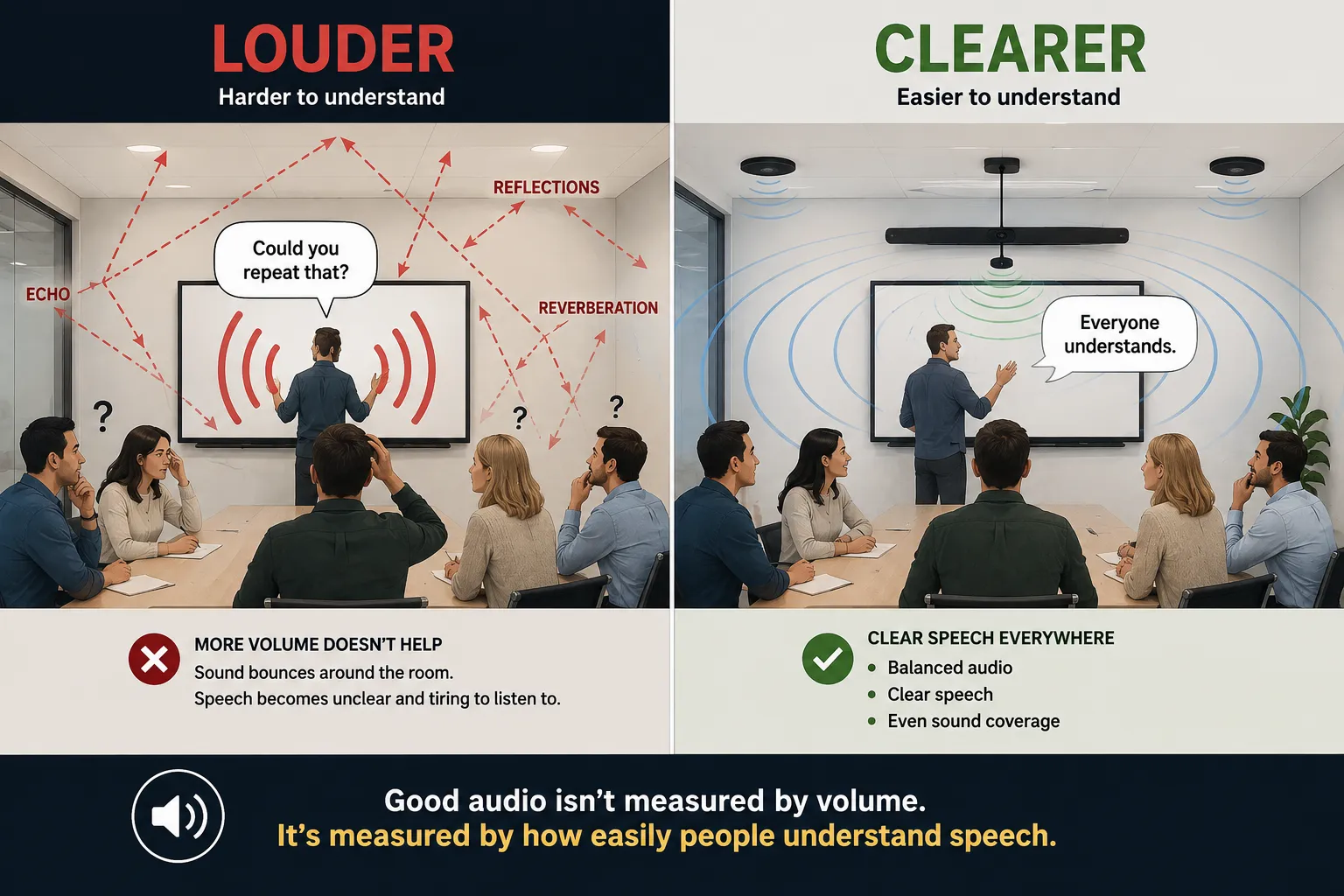
  • The most honest question isn't "How loud do the speakers go?" It's "Can everyone understand speech clearly from the back of the room?" That's an important difference. A room can be loud enough while still making conversations difficult to follow because reflections, reverberation and background noise reduce speech clarity.

    Diagram comparing louder audio with clearer speech using dedicated speakers and improved room acoustics
    When built-in speakers are usually enough — and when a dedicated audio system becomes worthwhile.
    Room Type Built-in Speakers Dedicated Audio System
    Small huddle roomUsually sufficientOptional
    Small classroomUsually sufficientWorth considering
    Large classroomOften limitedRecommended
    Training roomOften limitedRecommended
    Hall or auditoriumNot suitableEssential
    Common audio problems and the solution that usually makes the biggest difference.
    Problem Better Solution
    Room isn't loud enoughLarger or additional speakers.
    Speech sounds echoeyImprove room acoustics and reduce reverberation.
    Hard to understand speechBetter speaker placement or a dedicated audio system.
    Hybrid meetingsDedicated microphones and speakers.

    Hybrid meetings introduce another consideration: microphones. Remote participants will usually tolerate average video quality long before they tolerate poor audio. If voices are difficult to understand, even an excellent camera can't rescue the meeting experience.

    A SIMPLE TEST

    Stand at the very back of the room while someone speaks naturally from the front. If you instinctively ask them to repeat themselves or raise their voice, the solution isn't necessarily more volume. Better speaker placement, improved room acoustics or dedicated audio often makes speech much easier to understand without making the room noticeably louder.

    The goal isn't to make the room louder. It's to make speech easier to understand. Those aren't always the same thing.

Connectivity: USB-C, HDMI, Wireless Sharing and OPS

Most people compare port lists, yet what they're really buying is simplicity. Every extra adapter, cable or button press becomes something somebody has to remember every day. The best interactive whiteboard isn't necessarily the one with the most connections—it's the one that lets people start teaching or presenting with the least amount of effort.

Nearly every commercial interactive display now supports HDMI, USB-C and some form of wireless sharing. The real question isn't whether those connections exist, but whether they make everyday use simpler. A single USB-C cable carrying video, audio, touch and laptop charging removes one of the biggest sources of everyday frustration in shared classrooms and meeting rooms — remembering which cable goes where.

Comparison showing multiple cables versus a single USB-C connection for an interactive display
  • USB-C

    For many organisations, USB-C has become the preferred connection because it can carry video, audio, touch data and laptop charging through a single cable. Instead of connecting multiple leads every time someone changes presenters, one cable allows the display to behave almost like a docking station. It's one of the biggest everyday usability improvements modern interactive displays have introduced.

    HDMI

    HDMI remains the most universally compatible display connection and continues to be the safest choice where different laptops, media players or external devices are used. It doesn't normally carry touch control or laptop charging, but it remains reliable, familiar and widely supported.

    Wireless Sharing

    Wireless sharing is excellent for quick collaboration and casual presentations where presenters change frequently. It's generally best viewed as a convenience rather than a complete replacement for a wired connection. Wireless technology continues improving every year, but when reliability matters most, a cable still wins.

    OPS (Open Pluggable Specification)

    An OPS slot allows the computer inside the display to be upgraded independently of the screen itself. Think of it as replacing the PC while keeping the display. This can be valuable for organisations expecting the display to remain in service for many years, where computing requirements are likely to change faster than the panel itself.

    Many organisations never use an OPS slot because staff present directly from their own laptops. For others—particularly where the display runs dedicated software every day—an OPS computer can significantly extend the useful life of the installation without replacing the panel itself.

    Organisations supporting BYOD (Bring Your Own Device) environments usually benefit the most from full-featured USB-C connectivity because staff connect many different laptops throughout the day. The less presenters have to think about adapters and cables, the smoother every meeting or lesson becomes.

    WORTH CHECKING

    Not every USB-C connection supports the same features. Some ports carry video only, while others also provide laptop charging, touch control and high-speed data transfer. Before assuming a USB-C connection will replace every other cable, check exactly what that particular port supports. One USB-C port can be very different from another.

    How the most common interactive display connections compare.
    Connection Video Audio Touch Charging
    HDMI
    USB-C (Full Featured)
    USB-C (Basic) Varies Varies Varies Varies
    Wireless Sharing Limited
    A SIMPLE TEST

    Ask yourself how many cables someone needs to connect before they can begin presenting. If the answer is more than one or two, there's probably a simpler solution. Better still, ask someone unfamiliar with the room to connect their own laptop. If they can begin presenting without asking for help, you've probably designed the right setup.

    Remember that the best connectivity solution isn't necessarily the one with the longest specification sheet. It's the one that removes the most friction from everyday use. Teachers shouldn't need to remember which cable carries touch, presenters shouldn't need to hunt for power adapters, and meeting participants shouldn't spend the first five minutes troubleshooting connections instead of collaborating.

    The value of connectivity isn't measured by how many ports a display has. It's measured by how little people have to think about connecting their device before they can start teaching, presenting or collaborating.

Android, Windows or EDLA: Which Platform Best Suits Your Interactive Display?

Most people spend the meeting debating operating systems as though they'll determine whether the display succeeds. In reality, screen size, room layout and viewing conditions usually have a much bigger impact on the experience people have every day. Platform still matters — it simply comes later in the decision-making process.

Nearly every modern interactive display includes Android, many can be fitted with a Windows OPS computer, and an increasing number now carry Google's EDLA certification. None of these options is universally better than another. The right choice depends entirely on how the room will be used, the software people rely on every day, and how much integration is needed with existing systems.

  • Comparison showing Android, Windows and EDLA platforms for interactive displays

    Android

    Android has matured to the point where many classrooms and meeting rooms never need Windows at all. Modern Android-based interactive displays comfortably handle whiteboarding, annotation, web browsing, wireless sharing and everyday presentation tasks without requiring an additional computer.

    For organisations wanting a simple, low-maintenance solution, Android is often the easiest platform to live with. Faster startup, fewer moving parts and fewer software updates mean the display behaves more like an appliance than a traditional PC.

    Windows

    Windows becomes the better choice when people rely on software that simply doesn't exist on Android. Engineering applications, medical software, specialist finance programs, CAD packages and many industry-specific business applications still expect a Windows environment.

    If staff spend most of the day inside Windows software, adding a Windows OPS computer usually provides a better experience than trying to replace those workflows with Android apps. The goal isn't to force people to change how they work — it's to choose the platform that already supports the software they depend on every day. Our Android SoC vs Windows OPS comparison goes into more depth if platform is the deciding factor for your room.

    EDLA (Enterprise Devices Licensing Agreement)

    EDLA isn't a different operating system. Think of it as Google's official certification for Android. An EDLA-certified interactive display includes licensed Google Mobile Services, giving users direct access to Google Play, Google Drive, Google Docs, Google Classroom, Google Meet and the wider Google Workspace ecosystem.

    Schools and organisations already invested in Google Workspace often find EDLA simplifies sign-in, application deployment and ongoing device management across an entire fleet of interactive displays. Rather than treating the display as a standalone device, it becomes another managed part of the organisation's Google environment.

    Which platform is generally the best fit for different ways of working?
    PlatformBest Suited ForThings to ConsiderTypical Environment
    AndroidWhiteboarding, annotation, web browsing, wireless sharing and everyday presentations.Won't run every specialist Windows application.Most classrooms, training rooms and meeting rooms.
    WindowsSpecialist business software, engineering, CAD, medical and finance applications.Higher cost and additional PC maintenance.Organisations relying on Windows software every day.
    EDLA AndroidGoogle Workspace, Google Classroom, Drive, Docs and Meet.Best suited where Google services are already central to everyday work.Schools and organisations standardised on Google Workspace.
    A SIMPLE TEST

    Ask yourself one simple question: what software will people open first? If the answer is a web browser, whiteboard application, Google Classroom or Microsoft 365 online, Android is usually more than capable. If the answer is AutoCAD, MYOB, specialised medical software or another Windows-only application, then Windows isn't an upgrade—it's simply the correct tool for the job.

    The biggest mistake buyers make is choosing a platform because it sounds more powerful rather than because it better suits the people using the room. For many classrooms and meeting rooms, the simplest solution is also the one that requires the least maintenance and delivers the best day-to-day experience.

    The best platform isn't Android, Windows or EDLA. It's the one that allows people to begin teaching, presenting or collaborating with the least amount of effort while still supporting the software they genuinely rely on every day.

Planning Your Interactive Display Installation

Most installation problems aren't caused by the interactive display itself. They're caused by everything around it. Power, networking, wall construction, cable pathways and mounting locations are often left until installation day, when small oversights suddenly become expensive variations, delayed projects or untidy finished installations.

An interactive display is usually expected to remain in service for seven to ten years or more. Planning for future upgrades, additional cables, easier servicing and reliable network access costs very little during installation, but can become surprisingly expensive once the wall has been finished and the display is already in use.

  • Comparison showing a well-planned interactive display installation versus an installation that required rework
    A practical checklist before installation day.
    Item Why It Matters Easy to Fix Later?
    Power outlet location Avoids extension leads, visible power cables and awkward access behind the display. ❌ Usually difficult
    Network connection Provides the most reliable connection for software updates, remote management, wireless collaboration and future cloud services. ⚠ Possible
    Wall construction Confirms the wall can safely support the weight of the display and mounting system without additional reinforcement. ❌ Difficult
    Mounting height confirmed Ensures the display suits the people using the room rather than simply fitting the available wall space. ⚠ Possible
    Cable pathways and conduit Allows future HDMI, USB-C, network or control cables to be added without reopening finished walls. ❌ Very difficult
    Service clearance Leaves enough space to remove the display, replace cables or perform servicing without dismantling surrounding fixtures. ⚠ Possible

    Wireless casting works well in many classrooms and meeting rooms, but where multiple interactive displays operate throughout the same building, a wired network connection still provides the most predictable solution for software updates, remote management and collaboration features. Wi-Fi continues improving every year, but reliability is still the reason many organisations choose to install a network cable while the wall is open.

    COMMONLY OVERLOOKED

    Leave enough space behind or beside the display for future cable additions. Many installations look perfect on day one but become frustrating to maintain because there's no practical way to add another HDMI, USB-C or network cable later without removing the display or opening the wall.

    A SIMPLE TEST

    Stand where the display will be mounted and ask yourself one simple question: "If this room needed one more cable in five years' time, how would it get there without opening the wall?" If the answer isn't obvious, now is usually the easiest and least expensive time to plan for it.

    The best installations aren't necessarily the most expensive. They're the ones that anticipate future needs before the first cable is connected. Allowing for additional conduit, accessible power, spare network capacity and sensible service access costs very little during construction, yet can prevent years of unnecessary maintenance, disruption and retrofit work.

    The best installation isn't the one that's quickest to complete. It's the one nobody needs to think about again for the next ten years.

Common Interactive Whiteboard Buying Mistakes to Avoid

Most buying mistakes share the same root cause: the buying decision starts with the interactive whiteboard instead of the room. Buyers compare brands before measuring viewing distance. Brightness figures are compared before considering glare. Mounting height is chosen before thinking about who will actually use the display. Camera, audio and connectivity often become afterthoughts once the interactive whiteboard has already been selected.

Another surprisingly common mistake is assuming the newest model is automatically the best choice. Unless the latest generation genuinely solves a problem your room has, newer specifications often make very little difference to the people using the display every day. The best buying decisions are rarely driven by the newest features—they're driven by choosing the right solution for the environment.

One final consideration is long-term reliability. If you're wondering why commercial interactive displays are designed to operate for far longer hours than a consumer television, our explanation of commercial display duty cycles explains what those ratings actually mean in everyday use—and why the lowest purchase price doesn't always represent the best long-term value.

  • It's an easy trap because product comparisons are what buyers see online, in brochures and in showrooms. The room's own constraints only become obvious once the display is already on the wall. Working through the room first—viewing distance, lighting, mounting height, touch performance, connectivity and installation planning—prevents most of these mistakes before comparing a single manufacturer.

    Replace specification questions with room questions.
    Instead of asking... Ask yourself...
    Which interactive whiteboard brand is best? Which interactive whiteboard best suits this room?
    Which display is brightest? How much glare and ambient light does this room actually have?
    Which model has more features? Which features will people genuinely use every day?
    Which one costs less? Which solution offers the lowest ownership cost over the next 8–10 years?

    By now you've probably noticed that very few of the important decisions had anything to do with comparing manufacturers. The best interactive whiteboard isn't the one with the longest specification sheet or the newest feature list. It's the one that's so well matched to the room that people stop thinking about the technology altogether and simply get on with teaching, presenting or collaborating.

BEFORE YOU COMPARE BRANDS

Frequently Asked Questions

  • Most standard classrooms suit a 75-inch panel, comfortable up to roughly 6–7 metres of viewing distance, with 86-inch better suited to larger rooms or those with a back row beyond that. The general rule is that viewing distance should be four to six times the screen height for detailed content like text and diagrams — so the right size depends on measuring the room rather than matching what a similar-sized organisation chose, since two rooms of the same floor area can have very different back-row distances depending on layout.

  • Not necessarily, and higher brightness isn't automatically worth paying for. Brightness needs depend far more on a room's ambient light than on price — a windowless room or one with reliable blockout blinds rarely needs anything beyond standard commercial brightness, while a room with strong afternoon sun or large uncovered windows needs either a brighter panel or better window treatment. Brightness should always be matched to the room rather than compared as a standalone specification.

  • Brightness (measured in nits) only tells part of the story — how much light the room reflects back into the picture matters just as much. Two identical panels producing the same number of nits can look noticeably different if one is fighting glare from an uncovered window while the other has good anti-glare glass and better light control; the one with less reflected light will preserve more contrast and often appear to be the brighter display. This is why comparing two panels side-by-side under realistic lighting tells you more than comparing spec sheets.

  • EDLA (Enterprise Devices Licensing Agreement) isn't a different operating system — it's Google's official certification for Android. An EDLA-certified interactive display includes licensed Google Mobile Services, giving direct access to Google Play, Google Drive, Google Docs, Google Classroom, Google Meet and the wider Google Workspace ecosystem. Schools and organisations already invested in Google Workspace often find EDLA simplifies sign-in, app deployment and device management across an entire fleet, while for businesses not using Google Workspace, EDLA is usually far less important than choosing the right screen size, platform and room setup.

  • Most day-to-day use — annotating, casting slides, browsing, quick video — runs well on the built-in Android system alone, and adding Windows there mainly adds cost and management overhead without adding anything staff will use. Windows, added via an OPS slot or an external PC, is only genuinely needed where a room runs full desktop software daily, such as specialist teaching tools, CAD or finance software. Android is ideal for collaboration. Windows is ideal for specialist desktop software.

  • Built-in cameras work well in small rooms where everyone sits close to the display, but the same camera that looks fine in a 4-person huddle room can crop out the back row and the presenter in a long boardroom — room shape matters more than camera resolution. As a rule, boardrooms, training rooms and hybrid classrooms are usually better served by a dedicated conferencing camera, while small meeting rooms can often rely on what's built in. A 4K camera mounted in the wrong place still produces a poor meeting experience.

  • USB-C is generally the better everyday choice where the laptop supports it, since a single cable can carry video, audio, touch control and charging together, removing the need to connect multiple leads every time a presenter changes. HDMI remains the safer universal fallback for older laptops or external devices, though it doesn't carry touch or charging. Not all USB-C ports are equal — some carry video only — so it's worth confirming a given port supports full-featured connectivity before assuming it will replace every other cable.

  • Built-in speakers are usually adequate for a single presenter in a small or medium room. Larger rooms, halls, training rooms, or any room used regularly for video conferencing with multiple participants usually need dedicated audio, since the goal isn't to make the room louder — it's to make speech easier to understand. Remote participants also tend to forgive average video quality far more readily than poor audio, so investing in audio is often more valuable than upgrading the camera.

  • The most common mistake is comparing products before understanding the room. Screen size, brightness and brand get chosen before anyone measures viewing distance or checks how the room behaves in afternoon light — which usually leads to a panel that's the wrong size, too dim or too bright for its actual conditions, discovered only after installation.

  • An OPS (Open Pluggable Specification) slot allows the computer inside an interactive whiteboard to be upgraded without replacing the display itself — mainly useful for installations expected to stay in service for many years, where computing needs will change faster than the screen. Organisations where staff simply connect their own laptops via USB-C or HDMI day to day often never use the OPS slot, making it an easy feature to overpay for without ever needing it.

  • Technically yes, but consumer televisions are designed for home viewing rather than daily commercial use. Interactive whiteboards include touch technology, commercial duty-cycle ratings, stronger glass, business connectivity, annotation software and management features that consumer TVs simply aren't designed to provide. While a television may appear cheaper initially, it's rarely the better long-term choice in classrooms, meeting rooms or training environments where the display is used throughout the day.

    Our explanation of commercial display duty cycles covers this difference in more detail.

By now you've probably realised that choosing the right interactive whiteboard has far less to do with comparing products than understanding the room they'll be used in. That puts you ahead of most buyers, who compare specifications before they've measured anything.

The next step isn't to compare more specifications. It's to compare manufacturers through the lens of everything you've just learned.

Compare Leading Interactive Whiteboard Brands

Each manufacturer approaches interactive displays a little differently. Some focus on education, others on collaboration, Google integration, Windows environments or long-term enterprise management. Rather than asking which brand is "best," the better question is which brand best matches your room, your users and the way you'll use the display every day.

We've supplied interactive displays to schools, businesses and government organisations across Australia, helping customers choose systems that match the way their rooms are actually used — not simply the latest model available.

Still Unsure Which Interactive Whiteboard Is Right?

Working through everything above already puts you ahead of most buyers. Understanding the room first, rather than simply comparing specifications, avoids many of the mistakes that lead to disappointing installations.

Whether you're ready to compare interactive whiteboards or you'd simply like an independent opinion before making a decision, we're here to help.

  • ✔ Recommend an appropriate screen size
  • ✔ Explain whether Android, Windows or EDLA is the better fit
  • ✔ Help assess room lighting and viewing distances
  • ✔ Discuss camera, audio and connectivity requirements
  • ✔ Recommend products that suit your budget rather than simply the highest specification

Measured the room but still unsure which display is the right fit? Get in touch. We'd rather spend ten minutes helping you choose the right interactive whiteboard than see you spend years working around the wrong one.

ONE LAST THOUGHT

You're Not Really Buying Another Display

By now, it's probably clear that choosing an interactive whiteboard has very little to do with memorising specifications. The biggest decisions usually happen long before brands or model numbers are compared. They're made by understanding the room, the people using it and the experience you want to create every day. Once those things are clear, the right display often becomes surprisingly obvious.

The best technology rarely draws attention to itself. It simply feels right. People don't think about the screen size, the touch latency, the brightness or the number of ports anymore because the technology gets out of the way. Their attention shifts back to what really matters — teaching, learning, presenting, collaborating and sharing ideas.

Most of our satisfaction comes through what we can see, hear and touch. A display that's comfortable to read, natural to write on and easy to hear quickly becomes part of the room rather than another piece of equipment. When those experiences feel effortless, people naturally want to participate. Lessons become more engaging. Meetings become more collaborative. What could have felt like another daily chore becomes something people genuinely look forward to because the technology is helping people interact with each other instead of getting in the way.

Ultimately, that's what you're really buying. Not another display, but a room where people stop thinking about the technology and start focusing on each other.

Shopping Cart
Scroll to Top